
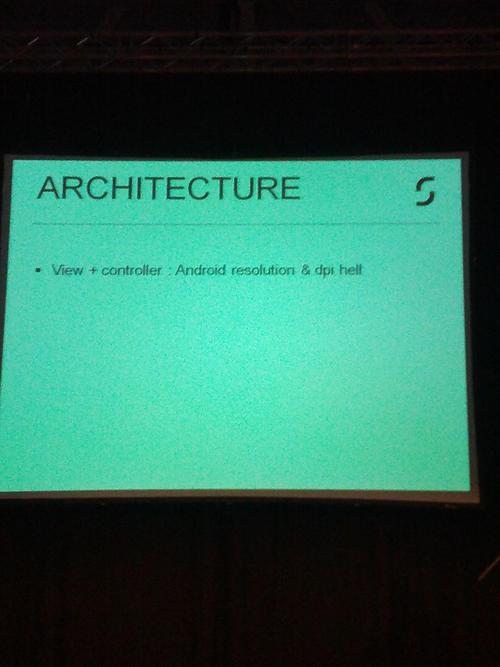
Yesterday the DroidconNL conference started with a keynote from greetz.nl called “Pushing Development Boundries”. After some introductory talk from their marketing manager, this slide appeared on screen:
To which I responded:
Sorry, but now you lost all credibility… #droidconNL pic.twitter.com/KqBV4Yoz
— Hugo Visser (@botteaap) November 22, 2012
I realise that might have sounded a bit harsh, so let me explain and give you some background. The last year I’ve been talking about “Embracing Fragmentation” at mdevcon, Mobile Down South and Apps World. The talk is about the challenges and opportunities developing and designing for the Android platform and showing what mechanisms are there to make it easy to deal with the “problem” of fragmentation, which honestly in my opinion as a professional Android developer, isn’t as huge as some people would like you to believe.
To me “hell” in the context of software implies something that is hard, complex, unpredictable, fragile and whatnot. Resolution and DPI on Android do not fall in this category for me. If you qualify these things as “hell” and you’re a professional Android developer, I think you need to read the rest of this post.
What’s this DPI thing anyway?
DPI is short for dots per inch, also known as pixels per inch or PPI. On iOS Apple calls things with a high PPI count “retina” to indicate that you can’t see the actual pixels on a screen since they are so close together that your eyes, or your retina, can’t see the individual pixels. In a way DPI tell you about the quality of a screen. Generally, when comparing screens of the same size, higher is better.
Now what’s the deal with resolution and DPI? Let’s say you have a 4 inch screen and a resolution of 1200×800 pixels. At the same time imagine a 10 inch tablet screen at 1200×800 pixels. Which screen would have the highest DPI? The 4 inch screen, since it literally packs more pixels / dots per inch. Get it? When designing a user interface this is important, for two reasons:
- You want your stuff make look good on any screen.
- You want your stuff have the same size on any screen.
How do we generally measure things on screens? Pixels. This works fine when all screens have the same DPI. Let’s say a screen has 100 dots per inch. That would mean that a line which is 100 pixels wide, would measure 1 inch exactly. Simple right? Now what happens if you draw that same line on a large screen, with the same resolution? There are less dots per inch, for example 50, so all of a sudden your 100 pixel line is now 2 inches wide. Not good!
On Android (and iOS for that matter) you don’t deal with pixels as the unit of measuring things. You deal with density independent pixels, or dips for short, or dp for even shorter. On iOS you’d call them points by the way. What measuring in dips gives you is a consistent unit that takes into account the DPI, which becomes essentially a scaling factor. Let’s say we’d call 50 dpi our “baseline” dpi at which 50 dips is exactly 1 inch. To make it show the same size on a 100 dpi device, we would take the scaling factor (twice the amount of pixels per inch) and draw it at 100 pixels, which would give us the same sized line. Why? Because 100 is twice 50, so our scaling factor is 2 and because 100 pixels at 100 dots per inch would be exactly 1 inch again. Confusing? Maybe, but the thing to remember is: you don’t deal with pixels. You tell the Android how large a thing should be in dips and Android will take into account the appropriate scaling factor, figure out the right amount of pixels and will make sure the thing you are drawing to the screen is the same size no matter what screen your app is running on. Same for iOS: you tell the OS how large the thing you are drawing to the screen is in points, the OS figures out how many pixels that would be for the screen (either the same amount or twice the amount for retina screens) and it will look the same size, no matter if you are running on a retina screen or a non-retina screen.
So that leaves us at DPI hell. I guess what the speaker was referring to is how to make your stuff look good on any screen. First of all, it’s good to know that Android currently has 5 DPI “buckets” that are relevant to developers. In order of lowest to highest DPI they are called ldpi, mdpi, hdpi, xhdpi and xxhdpi. As a contrast, iOS has two buckets: either non-retina or retina.
Like I said there’s a scaling involved when an app runs on various screens. Scaling stuff you draw yourself at runtime is usually not the issue. You are rendering that stuff when the app runs so things will always look good. But what if you include an image and that image should be scaled up or down to make it the proper size for the given dips and DPI?
In that case you have two options:
- You supply the image at a particular DPI and let Android deal with the scaling from that bucket to other buckets at runtime
- You supply a scaled version for one or more DPI buckets
One strategy could be to only supply the assets for the xhdpi bucket and let Android take care of the scaling. Depending on your assets and the version of Android you are targetting this might work fine. Usually though you need some tighter control over how images are scaled. A common strategy would be to supply assets for the mdpi, hdpi and xhdpi bucket and aditionally a launcher icon for the xxhdpi bucket. Since ldpi devices are rare, the Android platform would take care of scaling to ldpi by conveniently scaling down the hdpi asset by a factor of two. Likewise assets for the tvdpi bucket (hey! you said there we’re only 5 buckets! – I lied) should generally look fine when scaled by Android.
So you might be thinking: “wow, duplicating my assets for 3 different buckets AND creating 4 launcher icons seems like a lot of work”. Yes, it is. But I most certainly wouldn’t call it hell. Besides there are some great tools which help you to reduce the amount of work you need to do and Android has more mechanisms to reduce the number of bitmap assets in your project anyway.
One question remains: if it’s not hell, how should you approach this then? Here’s something that generally works when designing and scaling assets if you know the size in dips:
- Design your asset doubling the size in dips. If your image is 100×200 dips then in pixels you design it at 200×400 pixels. This is your xhdpi asset. This works because at xhdpi one dip is exactly 2 pixels, meaning the scaling factor is 2. At mdpi one dip is one pixel which is equally handy.
- Scale this asset down by 75%. This is your hdpi asset.
- Scale the xhdpi asset down to 50%. This is your mdpi asset.
- Put the assets in the correct resources folder within your project: drawable-xhdpi for xhdpi, drawable-hdpi for hdpi, drawable-mdpi for (yes!) mdpi.
I recommend starting from the highest DPI you need to the lowest, since scaling down from a higher resolution usually gives better results than scaling up from a lower resolution. I also recommend that for launcher icons, you use the excellent Android Asset Studio combined with an icon in svg format which will spit out the launcher icons in all DPI variations without even bothering scaling it yourself in your favorite asset creation tool.
Phew, that was a lot of text, just to explain it’s not hell, but seriously: if you are an Android developer you should know the rules to play by. If you know them, then making your apps look great isn’t hard. There’s a lot of information on the subject at d.android.com, for example on supporting multiple screens, which I encourage you to read.
I hope you found this post useful, please leave any feedback in the comments, Google Plus or tweet at me. Thanks!